Problem
Good forms are notoriously tricky to get right — and in a large organisation, the people making them are not designers.
Form quality decides two things at once: whether employees find the right form and get the help they came for, and how much work each request creates for the agents behind it. At global scale, support can be one of the largest budget items — and a form that can't be found or understood becomes emails, calls and rounds of clarification, the slow and expensive kind of support.
Who we designed for

Support1 agent, form creator
Are responsible for creating, sustaining and improving a particular process, as well as, being responsible for the outcomes of the process. They need a way to manage incoming requests.

Employee, end‑user of the form
Has a task and needs support in achieving it. Can be a person or a group's representative. In order to get support, they need to find the right way to get it.
Approach
Strategic reframe: from data collection to user assistance
The application the builder is part of is only a phase in the more general journey people in the company embark on when they need support with something. Acknowledgement of this by the team was important for a better understanding of where our users come from and what happens after they fill out their forms.
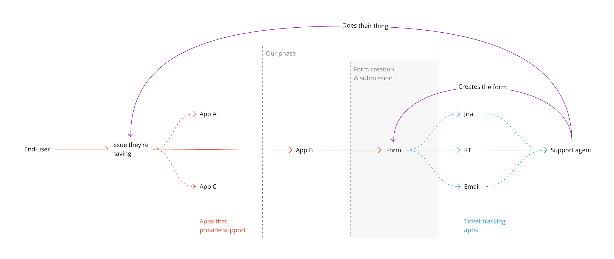
The journey mapping also gave us clarity and alignment on goals, expectations, and dependencies. Stakeholder interviews broadened that picture and surfaced concerns we hadn't anticipated.
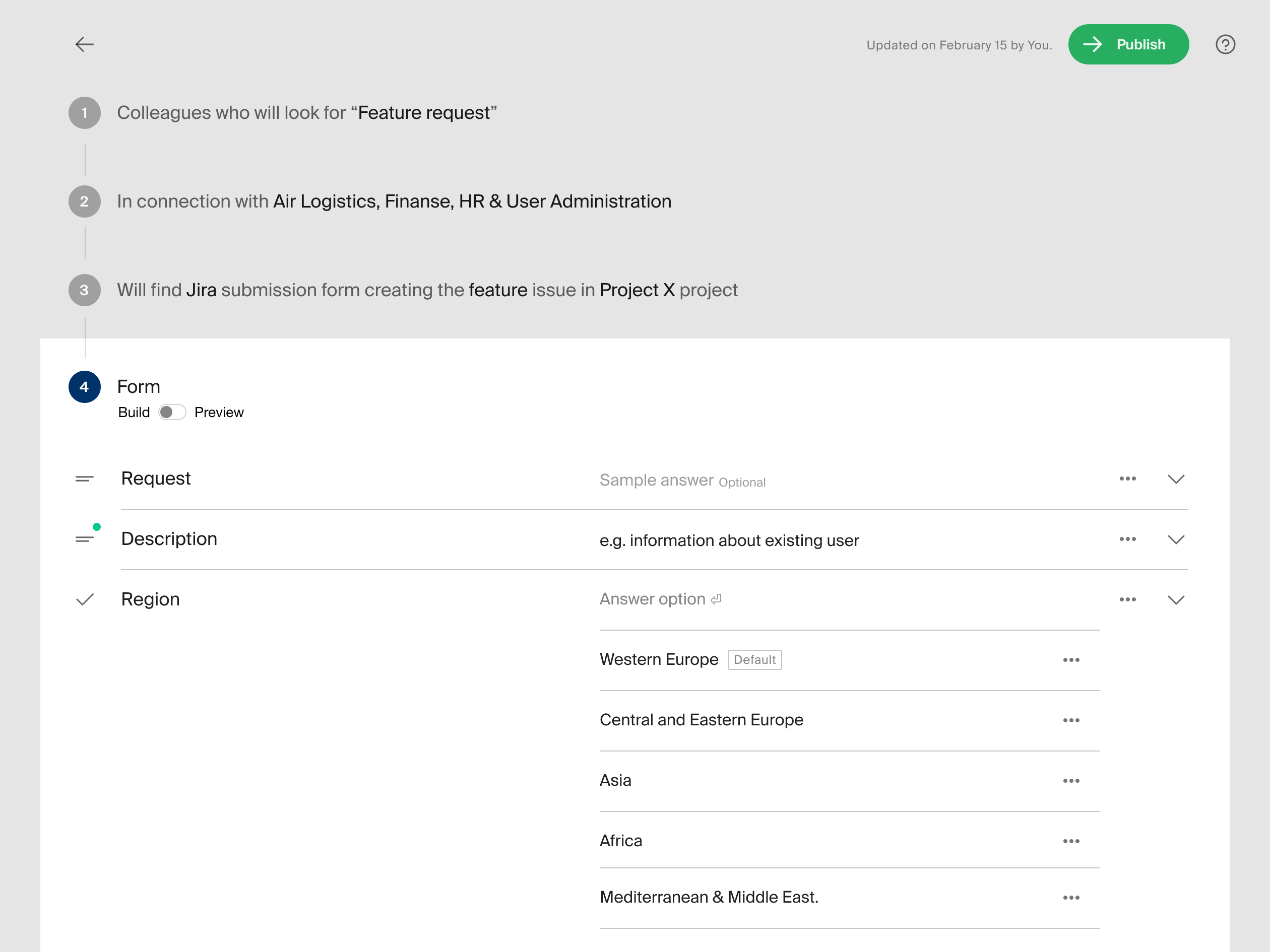
Seeing the builder as one step in the journey changed what we expected of it. A tool that only collected fields would leave form quality to people who are not designers, and the journey showed where that cost them: in forms nobody could find and questions nobody could answer. So the builder had to carry the craft itself, and we did that by dividing the work between the creator and the tool. The creator is asked only what they know best: what people will search for, and what answer a question expects. The tool takes care of what can be standardised, such as picking the right input, and brings in explanations, examples and defaults only when a question calls for them. And where a choice, such as setting a default, comes with a risk, the tool says so.
What the creator is asked
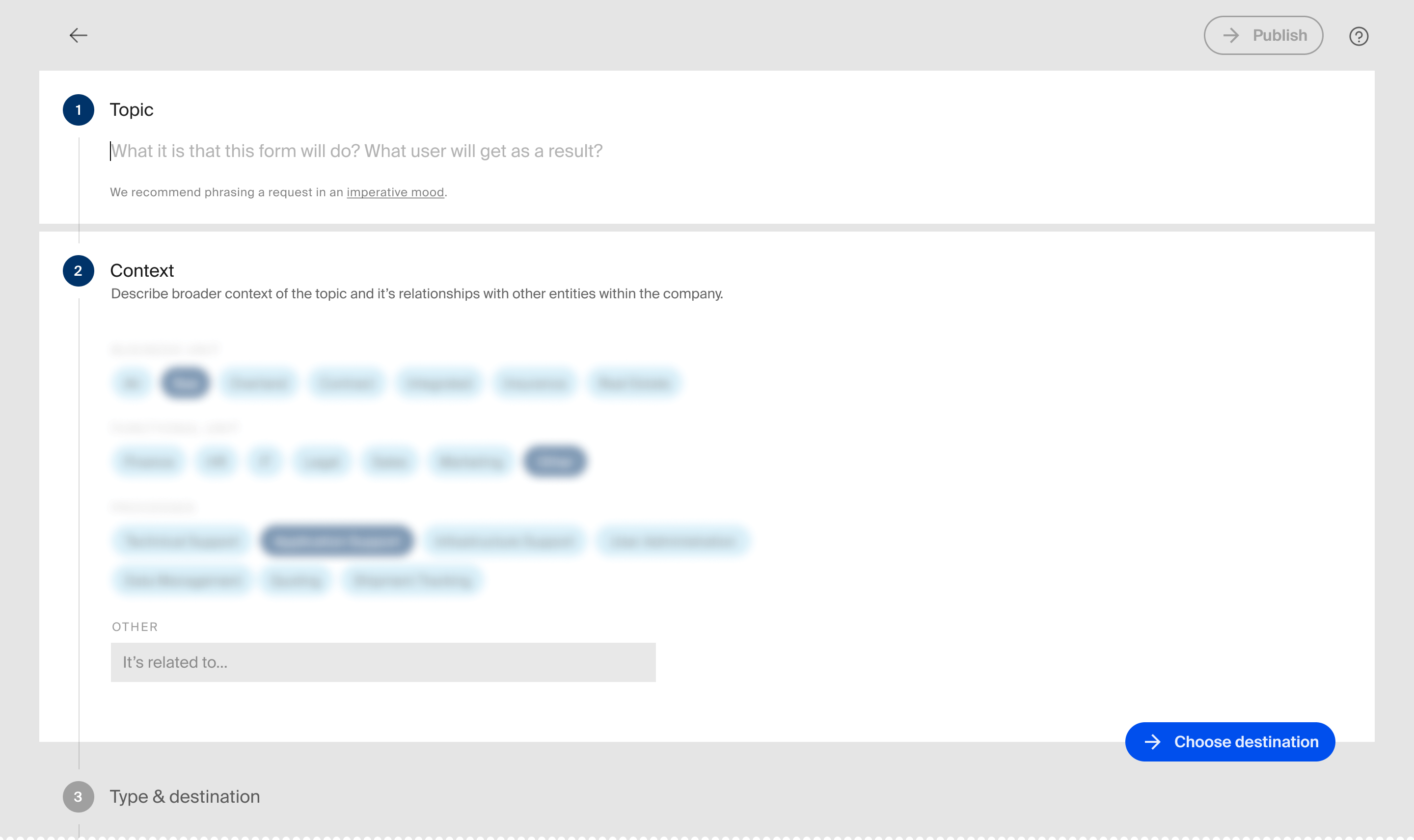
Creators are prompted with "What will users search for?" instead of "Name your form", so they describe the form in the words of the people who will look for it. Finding the right form was one of the biggest pain points of the previous incarnation of the app, and it is the creator who decides whether a form can be found.
The job of defining the topic of the form is divided between its title and the combination of tags. There are two parts to the form's definition: the immediate "topic" at hand and the broader "subject" space within which the process takes place. E.g. in "new user in HR system" the "new user" will be a topic and the "HR system" – its context that distinguishes it from other forms dedicated to the creation of users. It was important to build our search to understand different combinations between the two.2
The taxonomy also had to hold up across a large enterprise organisation spanning countries and business units: the same process named differently by region, the same word carrying different meanings between departments. Search had to absorb that variance rather than impose one canonical vocabulary on everyone.
What the tool decides
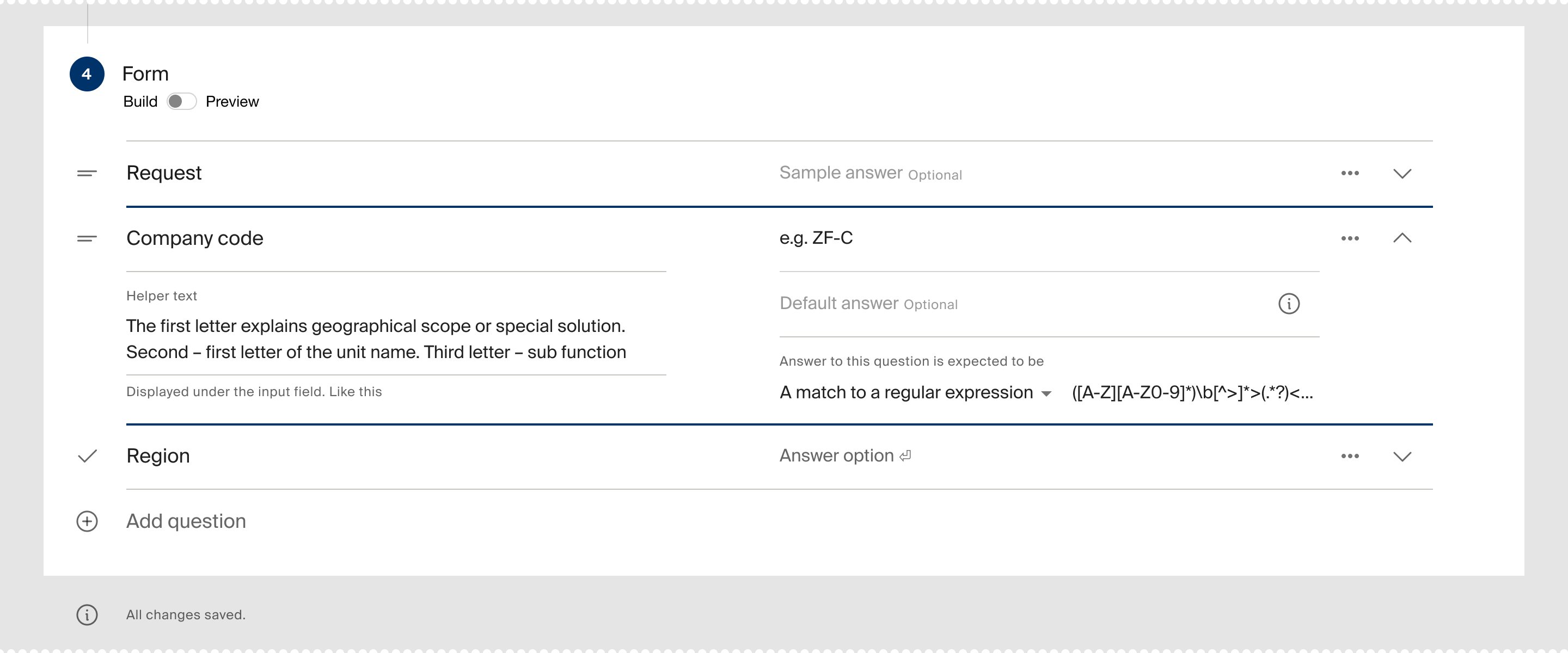
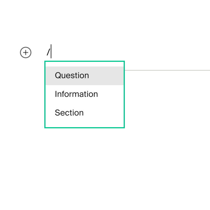
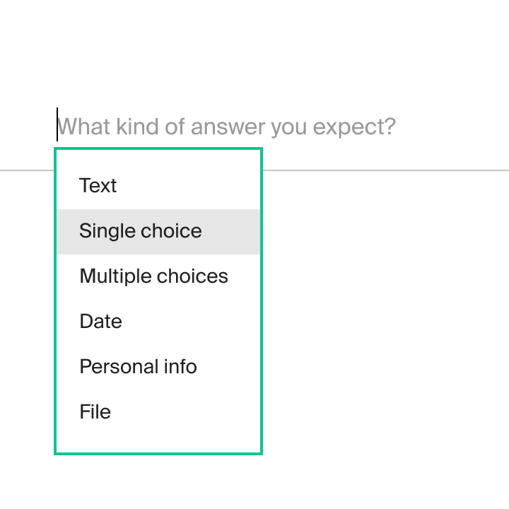
Inputs are named after the answer they collect, not the widget that collects it: Input field becomes Text, Checkbox becomes Yes/No, Date picker becomes Date. Whether choices render as radio buttons, checkboxes or a dropdown is the system's call, based on the number of options and other context.
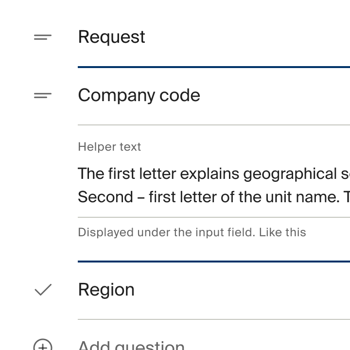
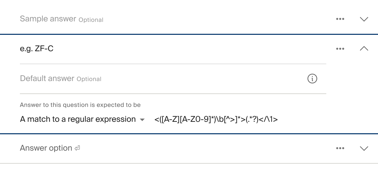
The rest of a question's setup is disclosed progressively. Explanations, examples and defaults are offered as further steps, not up front, so the creator sees them only when a question needs them. Simple questions stay simple to set up, and harder ones get their extra settings without burying the basics.
Where the tool warns
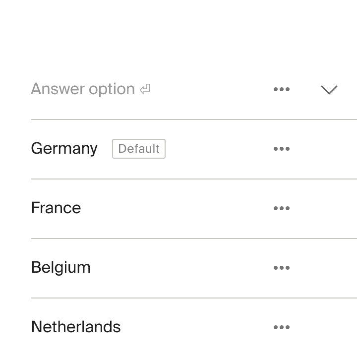
Pre-selecting the most frequent answer speeds a form up — but people tend to stick with whatever's already selected, which can nudge them down a certain path. The builder lets creators set defaults and cautions them about the risk at the same time. This is how most of the guidance in the builder works: creators can still make the riskier choice, and the tool counsels.
Impact
for support agents
The new interface improved the overall experience: usability testing and product analytics both confirmed better usability and higher satisfaction than the previous version.
for the rest of the employees
Most users found the appropriate form on their first try. Faster completion and fewer mistakes showed the resulting forms were easier to understand and fill out.